
Hosting Tutorials
Search results for:
Table of Contents
How to Create a Top Navigation Bar to Your Website
Tags: Web Site
This guide will explain how to build a simple responsive navigation bar on desktops and mobile. Are you ready to get started building your navigation bar? Me too, let's go.
Why You Need A Navigation Bar
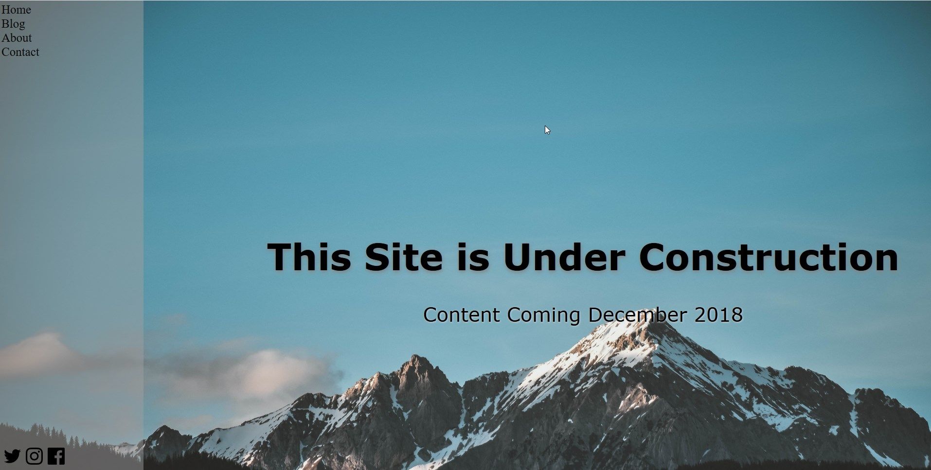
If your sites have multiple pages on them, you may want a way for your visitors to easily navigate between pages instead of having to type the URL each time they want to change pages. This guide will go over how to create the following navigation bar.
Make a plan
Depending on your site, there may be quite a few different subdomains. However, to provide ease of access to the visitors, the navigation bar should only include the pertinent links. It is time to decide which links need to be included and any additional content such as social media links or a login box that needs to be included.
Creating the Navbar For index.html
Before creating styles for the navbar, the elements and class need to be defined in the index.html page, which will serve as your website's homepage.
Step one: Creating the Navbar
This example uses the tag \
- list items.
Step two: Creating classes and links
Your site will probably use the navigation bar on multiple pages, which might also call similar elements. To make sure that the correct attributes are defined in the CSS, the elements you will need to use classes.
Here is an example of adding a href anchor inside each list item to allow the items to be linked to another page. These can be actual links like example.com/blog or file names as shown here:
Step three: Adding the social media icons
In this example, social media uses SVG Icons. This guide uses public domain icons. These were added in the file manager and called through their file path/name.
In the image above, the social media icons have very different formatting than the page links and can be seen on the lower left side. The is accomplished by adding a div container and creating two classes. The Div's class being 'social' and the li class social media.
Here is what this example's navigation bar HTML will look like for your index.html page:
Format Your Navbar In The css.css
To reduce the redundancy or overlapping of formatting, start with the most 'broad' element or class, then work down.
Step Four: Make the navbar vertical.
To make the vertical navigation bar cover the entire side of the screen, there needs to adjust some formatting. First, the top (a position from the top) should be changed to zero with the position fixed. Second, the height should be 100%, and the width would depend on the layout of your site. This is where the background color (including the opacity) will be called. Here is what the example's navbar class looks like:
Step Five: Formatting each element and class.
The more specific you want to be on, the element that needs to be more specifically called in the CSS. For example, classes can be used on different element types when there is an option in CSS to call the general class and the specific element in that class.
For example, to call the general div class social would look like this:
However, to call a specific element within the class like the list item anchor within the social media class would look like
The ul and li tags do have some predefined settings. The bullet points and underlines can be removed in this example by adding this attribute to the element ul.navbar li a
Here is an example of what the css.css for the navigation bar in this example looks like:
Step Six: Adding a hover effect
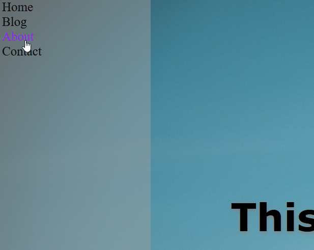
As seen in the above code segment, a hover effect can be added by including a section: hover to whichever element needs to be affected, shown here:
Make It Responsive
Edit your @media sections to create more layout options depending on screen size, as shown here:
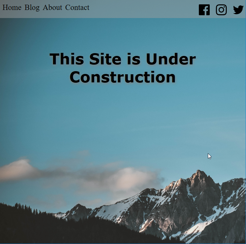
Mobile View:
A vertical navigation bar may not be the best fit for the site, depending on the screen size. However, adding some code to the @media tags can create a responsive navbar.
Step Seven: Change to a horizontal navbar
The current css.css has the navigation bar as vertical this can be changed by redefining the height and width attributes.
Because the links and icons were previously formatted to display horizontally, their attributes will need to be updated. Here are the examples @media sections for both 900px and 400px screen sizes
Test your site!
To prepare for different types of traffic, test your site using multiple browsers such as Mozilla, Chrome, and Safari. Also, check to make sure all of your links work and point to the correct location.
For reference
Here is the entire code used in this guide for your convenience:
index.html
css.css
body {
background-image:url('background-background-image-blue-sky-1054218.jpg');
background-size: 2000px;
background-repeat: no-repeat;
margin:0px;
}
ul.navbar{
top:0;
position:fixed;
background-color:#9e9e9e7a;
margin: 0;
padding:0.25em;
list-style-type: none;
width: 15%;
height: 100%;
}
.social{
position:fixed;
bottom:0;
}
li{
display:block;
}
ul.navbar li a{
font-size:25px;
color: rgb(11, 11, 11);
float:none;
text-decoration: none;
}
ul.navbar li a:hover{
color:blueviolet;
}
ul.navbar li.socialmedia{
float:left;
padding:5px;
}
.content {
font-family: verdana;
color:black;
margin: 20% 0 0 15%;
text-align:center;
}
h1{
font-size: 75px;
text-shadow: 1px 3px 8px grey;
}
p{
font-size: 40px;
text-shadow: 1px 1px 3px lightgrey;
}
p2{
display:none;
}
@media screen and (max-width: 900px) {
body{
background-size: 1500px, 1000px;
max-width: 1000px;
min-width: 400px;
height:100%;
}
.content {
margin-top:20%;
margin-left: 0;
}
h1{
font-size: 3em;
}
p{
display:none;
}
p2{
display:none;
}
.social{
position:relative;
}
ul.navbar {
max-width: 900px;
width: 100%;
height: 50px;
position: fixed;
top: 0;
}
ul.navbar li a {
float: left;
padding:5px;
}
ul.navbar li.socialmedia{
float:right;
margin-top:0;
}
}
@media only screen and (max-width: 500px) {
body {
background-size: 900px, 100%;
max-width: 400px;
}
.content {
padding:10px;
margin-top:45%
}
h1{
display:none;
font-size: 25px;
}
p{
display:none;
font-size: 20px;
}
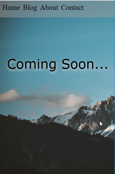
p2{
font-size: 45px;
display:block;
text-shadow: 1px 5px 10px lightgrey;
}
ul.navbar{
float:none
}
.socialmedia{
display:none;
}
<!DOCTYPE html>
<html>
<head>
    <title>Coming Soon</title>
    <link rel="stylesheet" href="css.css" >
    <meta name="viewport" content="width=device-width,initial-scale=1">
</head>
<body>

<ul class="navbar">

  <li><a href="main.html">Home</a></li>
  <li><a href="main.html">Blog</a></li>
 <li><a href="main.html">About</a></li>
  <li><a href="main.html">Contact</a></li>
<div class="social">

   <li class="socialmedia"><a href="https://twitter.com/example" >
        <img title="Twitter" alt="Facebook" src="iconfinder_twitter_3009565.svg" width="35" height="35" />
    </a></li>
 <li class="socialmedia"><a href="https://www.instagram.com/example/?hl=en" >
        <img title="Instagram" alt="Twitter" src="iconfinder_instagram_3009537.svg" width="35" height="35" />
    </a></li>
   <li class="socialmedia"><a href="https://www.facebook.com/example/?hl=en" >
        <img title="Instagram" alt="Instagram" src="iconfinder_facebook_3009513.svg" width="35" height="35" />
    </a></li>
    </div>

</div>
</ul>
<div class="content">
    <h1>This Site is Under Construction</h1>
        <p>Content Coming December 2018</p>
      <p2>Coming Soon...</p2>
</div>

</body>
</html>
@media screen and (max-width: 900px) {
    body{
        background-size: 1500px, 1000px;
        max-width: 1000px;
        min-width: 400px;
        height:100%;
    }
 .content {
   margin-top:20%;
   margin-left: 0;
    }
    h1{
        font-size: 3em;
    }
    p{
        display:none;
    }
    p2{
        display:none;
    }
.social{
    position:relative;
}
    ul.navbar {
        max-width: 900px;
        width: 100%;
        height: 50px;
        position: fixed;
        top: 0;
    }

        ul.navbar li a {
    float: left;
    padding:5px;
        }

ul.navbar li.socialmedia{
    float:right;
    margin-top:0;

}
}

@media only screen and (max-width: 500px) {
    body {
        background-size: 900px, 100%;
        max-width: 400px;
    }
    .content {
padding:10px;
        margin-top:45%
    }
        h1{
        display:none;
            font-size: 25px;
        }
    p{
         display:none;
        font-size: 20px;
    }
p2{
    font-size: 45px;
    display:block;

    text-shadow: 1px 5px  10px lightgrey;
}
ul.navbar{
    float:none
}
.socialmedia{
    display:none;
}
ul.navbar {
    max-width: 900px;
    width: 100%;
    height: 50px;
    position: fixed;
    top: 0;
}
ul.navbar li a{
    font-size:25px;
    color: rgb(11, 11, 11);
    float:none;
    text-decoration: none;
}

ul.navbar li a:hover{
    color:blueviolet;
}
ul.navbar{
    top:0;
    position:fixed;
    background-color:#9e9e9e7a;
    margin: 0;
    padding:0.25em;
    list-style-type: none;
    width: 15%;
    height: 100%;
}

.social{
    position:fixed;
    bottom:0;
}

li{
 display:block;

}
ul.navbar li a{
    font-size:25px;
    color: rgb(11, 11, 11);
    float:none;
    text-decoration: none;
}

ul.navbar li.socialmedia{
float:left;
    padding:5px;

}
.content {
    font-family: verdana;
    color:black;
    margin: 20% 0 0 15%;
     text-align:center;
}
text-decoration: none;
ul.navbar li.socialmedia{}
.social{}
ul.navbar{
    top:0;
    position:fixed;
    background-color:#9e9e9e7a;
    margin: 0;
    padding:0.25em;
    list-style-type: none;
    width: 15%;
    height: 100%;
}
<ul class="navbar">

  <li><a href="main.html">Home</a></li>
  <li><a href="main.html">Blog</a></li>
 <li><a href="main.html">About</a></li>
  <li><a href="main.html">Contact</a></li>
<div class="social">

   <li class="socialmedia"><a href="https://twitter.com/example" >
        <img title="Twitter" alt="Facebook" src="iconfinder_twitter_3009565.svg" width="35" height="35" />
    </a></li>
 <li class="socialmedia"><a href="https://www.instagram.com/example/?hl=en" >
        <img title="Instagram" alt="Twitter" src="iconfinder_instagram_3009537.svg" width="35" height="35" />
    </a></li>
   <li class="socialmedia"><a href="https://www.facebook.com/example/?hl=en" >
        <img title="Instagram" alt="Instagram" src="iconfinder_facebook_3009513.svg" width="35" height="35" />
    </a></li>
    </div>

</div>
</ul>
<ul class="navbar">
  <li><a href="home.html">Home</a></li>
  <li><a href="blog.html">Blog</a></li>
  <li><a href="About.html">About</a></li>
  <li><a href="Contact.html">Contact</a></li>
</ul>
<ul class="navbar">
  <li>Home</li>
  <li>Blog</li>
  <li>About</li>
  <li>Contact</li>
</ul>
Written by Hostwinds Team / June 5, 2021