
Hostwinds Tutorials
Search results for:
Table of Contents
How to make your website Mobile Friendly
Tags: Web Site, Optimization
In this guide, we will learn how to make a simple landing page mobile-friendly. This guide requires you to create an index.html page with a CSS style sheet. We have previously covered this topic to follow this guide and learn how to create your own HTML landing page with HTML and CSS.
Why You Need A Mobile Site
Most websites are designed to be viewed on devices like computers with decently sized screens. On a computer, the site may look simple and clean, but when viewed on a mobile device with a smaller screen, this can cause issues. Thankfully, this can be resolved in a few different ways. This guide will explain how to alter the style for a predefined screen size by editing the HTML and CSS files.
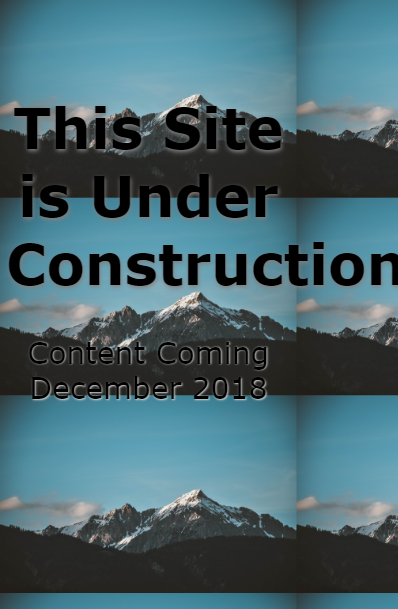
Here is the example site as displayed on a computer:

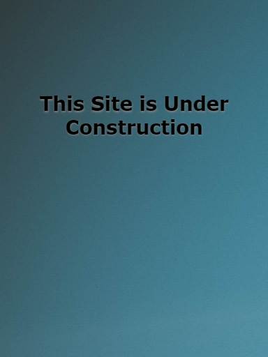
Here is the same site displayed on a much smaller screen:
Editing the Site
For reference during this, here are the original index.html and css.css for our example site above.
index.html
Coming Soon
This Site is Under Construction
Content Coming December 2018
css.css
body {
background-image:url('background-background-image-blue-sky-1054218.jpg');
background-size: 100%,100%;
}
div {
font-family: verdana;
color:black;
text-align: center;
margin-top:250px;
}
h1{
text-align:center;
font-size: 75px;
text-shadow: 2px 1px 1px grey;
}
p{
font-size: 40px;
text-shadow: 1px 1px 3px lightgrey;
}
Step One: Adding the meta tag
To make sure the browser recognized the new styles, we will need to add the following line inside the tag of the index.html file.
Without this tag, you may be able to see your changes in some browsers like Mozilla but not Chrome.
Step two: Create different @media sections for the desired screen sizes
This example will create two different device sizes 400px and 900px. When creating the @media section, you need to have both the max-width to identify which screens are using this style and set the actual display screen size for the style. The identifier will be in the @media screen and (max-width:) and the actual style for it will be inside the body tag.
@media screen and (max-width: 900px) {
body{
max-width: 900px;
min-width: 400px;
}
@media only screen and (max-width: 400px) {
body {
max-width: 400px;
}
}
An @media section for each screen size is needed. For this example, we are going to use 2 default sizes:
For screen size with 900px like a tablet:
@media screen and (max-width: 900px) {}
For devices like your cellphone 400px:
@media screen and (max-width: 400px) {}
This example used a max-width, meaning any screen with that size or less will follow those style rules.
Inside these tags is where the style will be redefined to better fit the different screen sizes. This example changes to background and font sizes and hides some objects to keep a clean appearance.
Depending on your background image, you might want to play around with the different sizing to get the best effect. This example used a larger image size to ensure there was no distortion of the image and there was no white space.
Step three: Changing the Background and font
In this example, we set the background to 100% height and 100% width. This makes sure the image dimensions stay constant, but it shrinks the image and repeats it across the screen in the above example. In a few ways, this can be resolved. First, change the background-size attribute in the main css.css to auto.
body {
background-image:URL('background-background-image-blue-sky-1054218.jpg');
background-size: auto;
}
Defining images as auto only makes sure the image and text will fit on the screen. To adjust the site to display the best for different screen sizes, these attributes should be added to your @media tags.
Here is what the example site looks like just using auto:
Adding this code to the css.css file
@media screen and (max-width: 1100px) {
body{
background-size: 1600px, 100%;
max-width: 900px;
min-width: 400px;
height:100%;
}
div {
    margin-top:35%
}
h1{
    font-size: 55px;
}
}
@media only screen and (max-width: 400px) {
body {
background-size: 900px, 100%;
max-width: 400px;
}
h1{
font-size: 55px;
}
}
Defining new attributes

Step four: Hiding Content
If you notice, also removed the "Content Coming December 2018" to help make sure our page is simple and easy to read on any screen. I did this by adding the display: none; in our
Here is the @media section for 900px:
@media screen and (max-width: 900px) {
body {
background-size: 1500px, 1000px;
max-width: 900px;
min-width: 400px;
}
h1{
font-size: 35px;
}
p{
display:none;
}
Step five: Adding new content
When working with significantly smaller screens than the one you originally designed, you might need to change what context you display. In our 400px example, we did just that.

The size was adjusted, and the unwanted text was hidden using the display: none; but we also change the top margin and added a new object.
The new object needs to be added to both the index.html and the CSS
Here is what the full index.html looks like for this example:
Coming Soon
This Site is Under Construction
Content Coming December 2018
Coming Soon...
The text should only show up on screen 400px or less, both the main styles and the @media for the 900px need to have the hidden. Here is the full css.css for this example:
body {
background-image:url('background-background-image-blue-sky-1054218.jpg');
background-size: 100%, 100%;
background-repeat: no-repeat;
}
div {
font-family: verdana;
color:black;
text-align: center;
margin-top:250px;
}
h1{
text-align:center;
font-size: 75px;
text-shadow: 2px 1px 1px grey;
}
p{
font-size: 40px;
 text-shadow: 1px 1px 3px lightgrey;
}
p2{
display:none;
}
@media screen and (max-width: 900px) {
body {
background-size: 1500px, 1000px;
max-width: 900px;
min-width: 400px;
height:100%;
}
h1{
font-size: 50px;
}
p{
display:none;
}
p2{
display:none;
}
}
@media only screen and (max-width: 400px) {
body {
background-size: 900px, 100%;
max-width: 400px;
}
div {
    margin-top:45%
}
    h1{
    display:none;
    font-size: 25px;
}
p{
     display:none;
    font-size: 20px;
}
p2{
font-size: 30px;
display:inline;
text-shadow: 2px 1px 3px lightgrey;
}
}
Test your Site!
You can use your browser's developer tools to view how the page will be displayed on different devices.
Written by Hostwinds Team / December 3, 2018