
Hostwinds Tutorials
Search results for:
Table of Contents
Improving your website with Google Analytics
Tags: Web Site
In this article, we'll show you how to use Google Analytics to identify the most important pages of your website. By "important", we mean pages that have (among other things):
- The greatest number of page views (a measure of visibility)
- The greatest average time on page (a measure of engagement)
For example, consider the following chart:
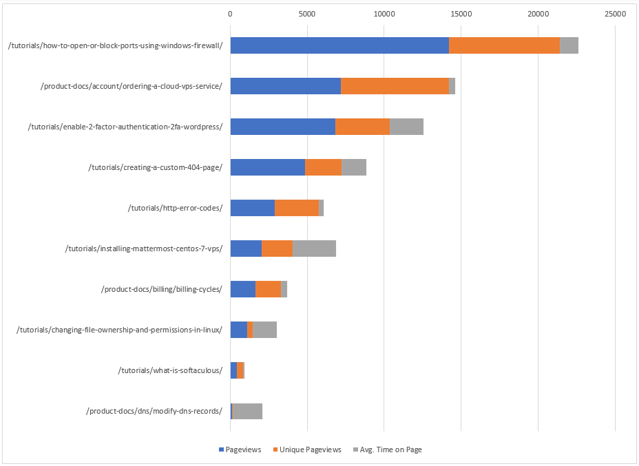
This chart provides, in priority order, the list of web pages that offer the greatest potential return on investment (ROI). For example, if we invest our time and effort in improving /tutorials/how-to-open-or-block-ports-using-windows-firewall/ first, that investment should provide the greatest ROI. The next page to invest in would be /product-docs/account/ordering-a-cloud-vps-service/, and so forth. In this article, we'll show you how (among other things) to create a chart similar to the above to help facilitate the improvement of your own website.
Before proceeding, if you have not set up Google Analytics (GA) to collect data for your website, see Use Analytics with your site to learn how to do so. Otherwise, we'll assume you have a reasonable amount of GA data for your site.
In the following, we'll be analyzing the section of a website containing customer-facing documentation but this is immaterial - you can replace this particular focus with whatever makes sense for you - product pages, support pages, image pages, or all of the pages of your website. With that said, the first step in this process is to download the GA data for your website:
Downloading
1. Navigate to the Google Analytics account associated with your website.
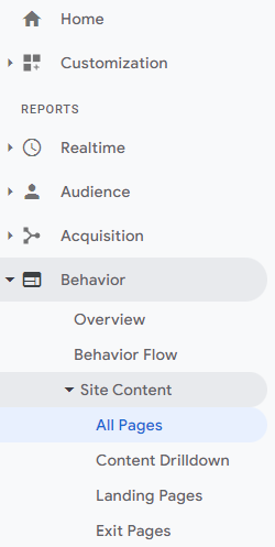
2. Select Behavior, Site Content, and then All Pages:
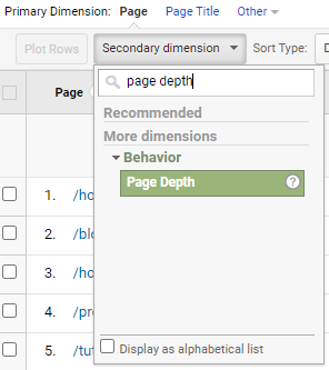
3. Select the Secondary dimension drop-down and type page depth, then select Page Depth:
This adds an additional column to the report table and can increase the resulting number of rows. Page depth is a dimension that may be useful in identifying high ROI pages for your particular scenario. In a nutshell, page depth is a histogram detailing the number of pages users visit per browser session (i.e., before they leave your site). Consider the following:
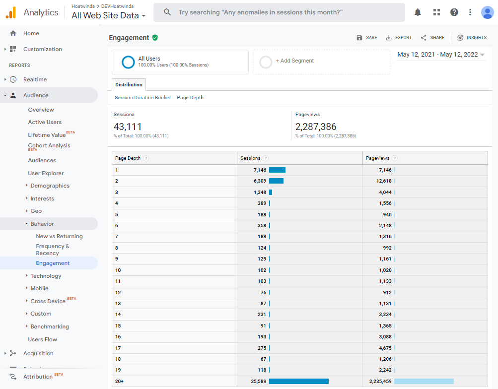
Between 5/12/21 and 5/12/22, we see that 7,146 users (7,146/2,287,386 = 0.31%) viewed 1 and only 1 page during their browser session. Similarly, 6,309 users (0.28%) visited 2 pages before leaving the site, and so forth. The above image should help to clarify Google Analytics' official definition of page depth:
This dimension creates a histogram of values by number of pages, ranging from 1 - 20+, which are then applied across visitor sessions. The intersection of the two shows the number of pages viewed in a session. For example, your report might show that 1000 visits accounted for views to one page only, 250 visits accounted for views to 2 pages, 50 accounted for views to 3 pages, and so on through the distribution of possible numbers of pages viewed in a session.
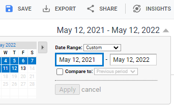
4. Choose a date range that doesn't produce too few or too many rows of data:
Currently, GA can only display and export 5000 rows of data at a time (note the EXPORT button in the prior image). To display and export more than 5000 rows, use the following tool at the bottom of the report table:

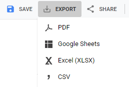
In this case, there are 16662 / 5000 = 3.33 report pages to export to Excel (or similar) where they can be combined. Four different export formats are available:
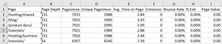
Exporting a report using the Excel format results in a spreadsheet similar to the following:
If you are exporting multiple reports, you will note that at the bottom of each spreadsheet is a row of summary data (see row 5002):
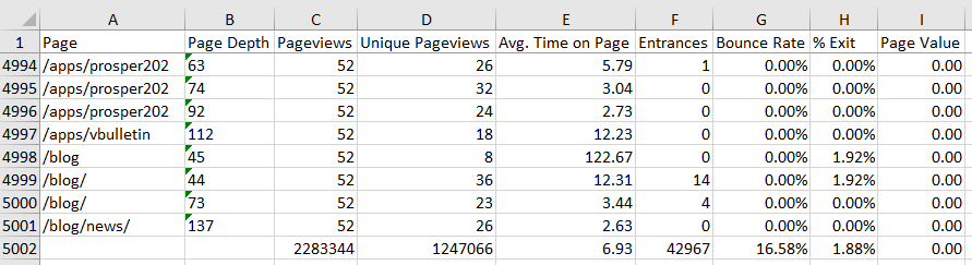
This row of summary data is identical in each export, so you need only keep the last row of the last export.
Processing
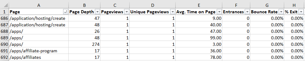
1. If you want to analyze all of the pages of your site, you may want to skip this step. Otherwise, you must remove all rows (pages) that are not applicable to your scenario. For this example, we're interested in just the documentation pages. These pages begin with /blog, /product-docs, and /tutorials and so we begin the culling process by removing all rows that do not begin with /blog, /product-docs/, and /tutorials. One approach to this is to sort the Page column and delete all non-applicable rows. For example, we'd delete all rows beginning with /application, /apps, .etc:
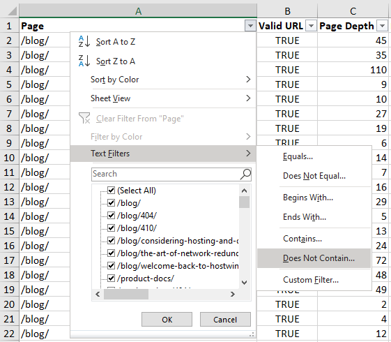
Text filters may also be useful in this culling process:
Be aware that other page types may need to be removed as well, such as landing pages, custom error pages (i.e., https://www.hostwinds.com/blog/404), and pages that no longer exist on the website, as discussed next.
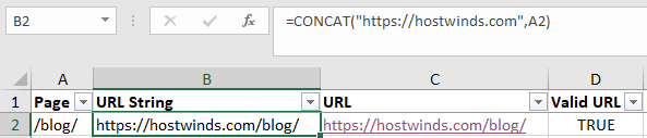
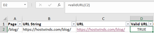
2. To test for non-existent web pages, you must first create URLs from the given GA page paths. One approach is to use CONCAT with your base domain name, as in the following example:
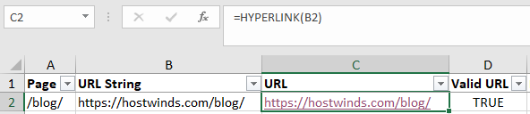
Next, you can use HYPERLINK to create clickable URLs:
As opposed to clicking each URL to see if it's valid, we can automate the process by using the following VBA script, which returns TRUE if a given URL is valid:
Function validURL(sURL As String) As Boolean
  Dim oXHTTP As Object
  Set oXHTTP = CreateObject("MSXML2.ServerXMLHTTP")

  oXHTTP.Open "HEAD", sURL, False
  oXHTTP.send

  validURL = IIf(oXHTTP.Status = 200, True, False)
End Function
To use the script in Excel, press ALT + F11, then enter and save the above VBA code. Next, save the workbook as an XLSM file. You can then access the validURL formula from within Excel just like any other Excel formula, as shown:
For Google Sheets, the following script will return 200 if the given URL is valid:
function getHtmlStatusCode(url) {
  var response = UrlFetchApp.fetch(url);

  return response.getResponseCode();
}
At this point, you should be able to easily sort and delete all rows with invalid URLs.
3. With all of the non-applicable rows (pages) removed, you may note that there are multiple rows of data for a single page. For example, there's a single /blog/ page with multiple rows of associated data (a one-to-many relationship):
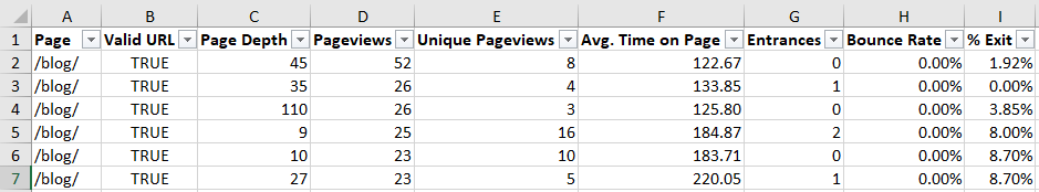
All of this data for the single /blog/ page must be combined in some way. Luckily, a pivot table can readily complete this task, as shown in the following example:
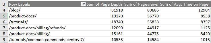
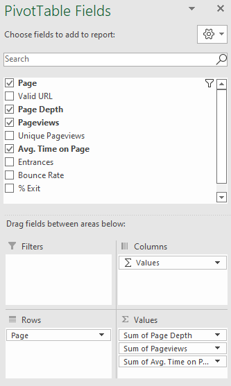
To create an Excel pivot table, select all of the relevant data (for example, columns A through I in the above one-to-many image), select Insert, and then select PivotTable. From there, you can obtain the collated sums as shown:
In this process, you may identify various GA page paths that you still need to combine into one. For example, you might notice something akin to /blog and /blog/ that should be combined into a single entity (/blog → /blog/) since they both point to the same page. You might also discover unexpected landing or other pages that must be removed from the set as well. This "discover-and-fix" process is not uncommon and may take a few iterations to complete. With the GA data fully processed, we can move on to analyzing it.
Analyzing
From the above process, you should now have a dataset of pages (rows) meeting your requirements. For the example case, this is a dataset of all individual documentation pages, such as Manage Domains (as opposed to landing and other pages like Domains). An example follows:
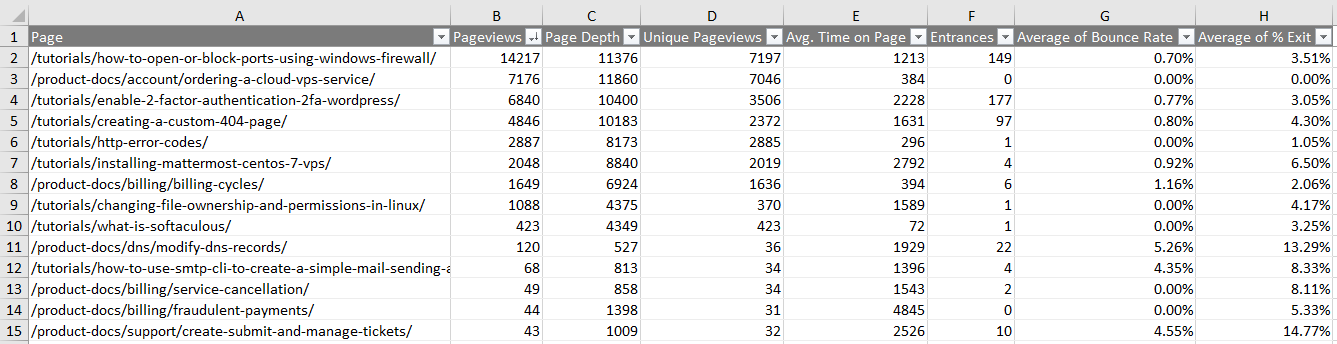
From the above table, we see that there are a number of GA metrics/dimensions to help identify key pages. For example, a chart of Pageviews, Unique Pageviews, and Avg. Time on Page might be of utility for your particular scenario (sorted by Pageviews, blue):
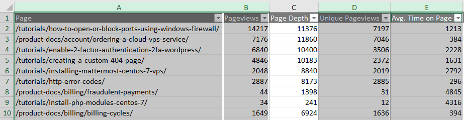
1. To create a chart in Excel similar to the above, using the Ctrl key, select the four columns Page, Pageviews, Unique Pageviews, and Avg. Time on Page:
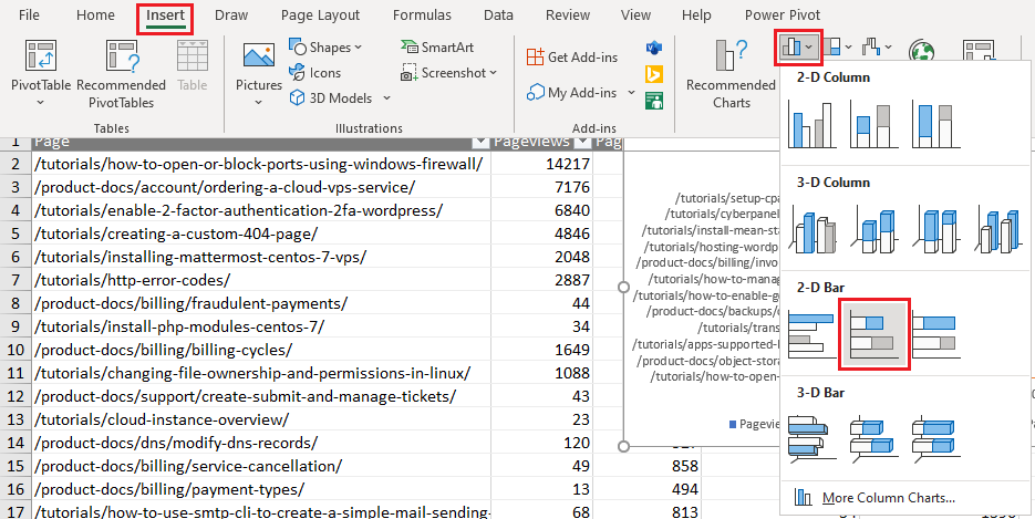
2. Select Insert, the bar chart icon, and then the horizontally stacked bar chart icon, as shown:
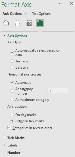
3. In the resulting chart, right-click the horizontal axis labels and choose Format Axis... In the Format Axis dialog, check Categories in reverse order:
4. To limit the number of visible labels (pages), select the filter/funnel icon, deselect all categories, and then reselect the top few pages:
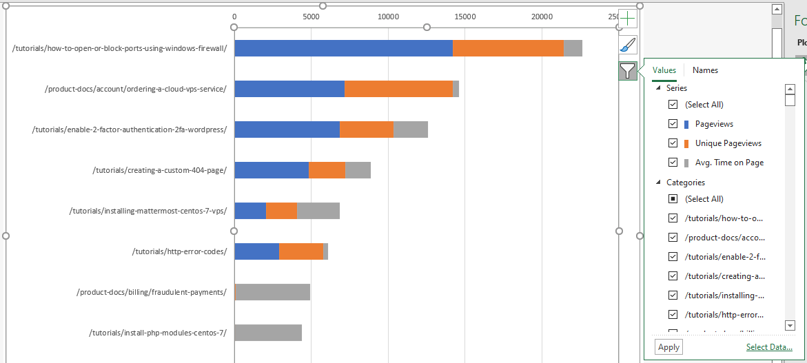
From the resulting chart, we see that the page /tutorials/how-to-open-or-block-ports-using-windows-firewall is an important one, followed by /product-docs/account/ordering-a-cloud-vps-service, and so forth. In fact, the above chart suggests an interesting single metric that may be of value, as discussed next.
5. There are a number of possibilities to create useful metrics from the available GA data. For example, one could standardize the sum of Pageviews, Unique Pageviews, and Avg. Time on Page to be between 0 and 1, as shown (note formula bar):
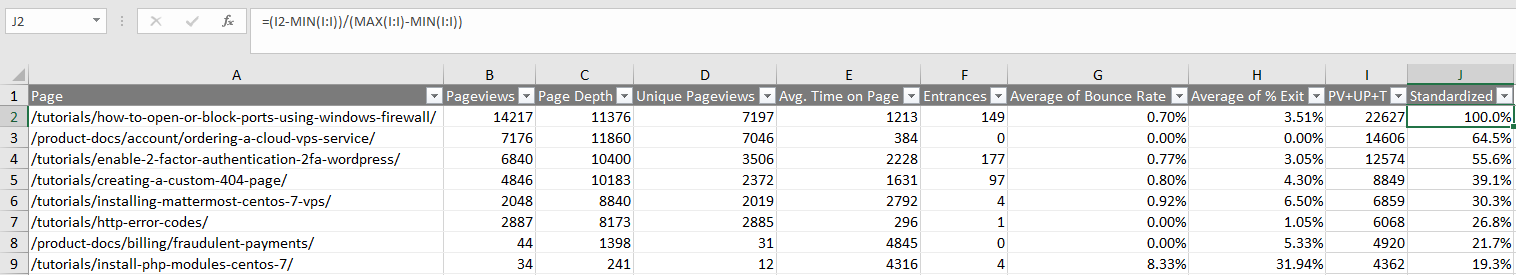
In the above, cell I2 is =SUM(B2,D2,E2) and J2 is =(I2 - MIN(I:I)) / (MAX(I:I) - MIN(I:I)). This standardizes the data and leads to the following chart: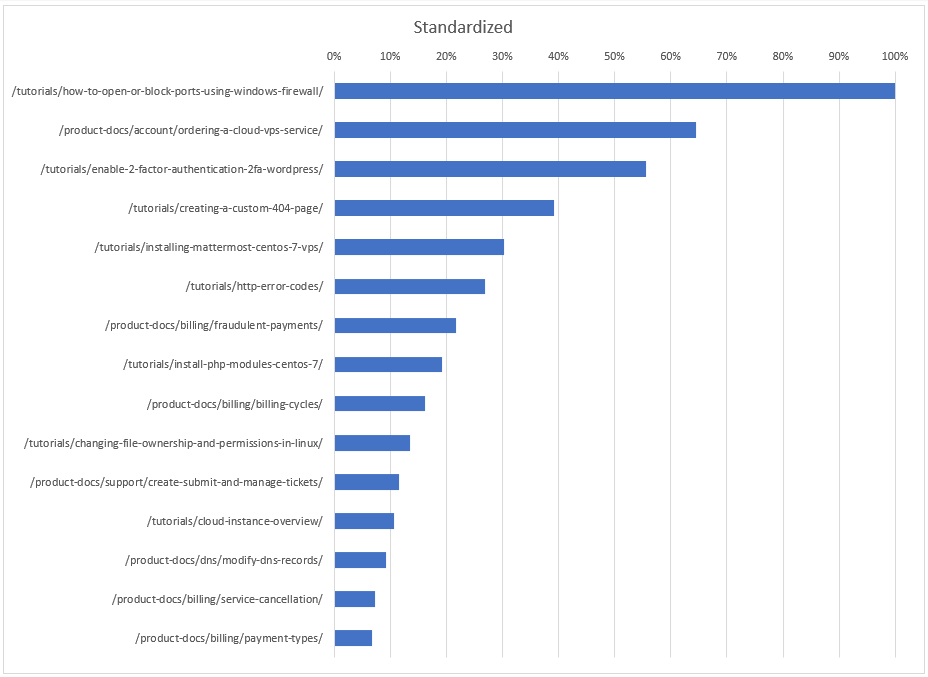
If we are satisfied with this particular metric, then we could conclude that the /product-docs/account/ordering-a-cloud-vps-service/ page is about 65% as important as the /tutorials/how-to-open-or-block-ports-using-windows-firewall page, and so on down the list.
Conclusion
Information similar to the above can help you determine which pages of your site deserve your focus, attention, and investment, and in what order, to help maximize your ROI. For example, the prior chart indicates which documentation pages should be scrutinized and improved upon first by adding, (for example) up-to-date screenshots, ensuring clear and concise content, and so forth. This information could even be used to help identify which topics to include in a customer survey to learn how to best improve the associated documentation.
It is our hope that the example presented in this article can be leveraged to help you improve the performance of your own website using this data-driven approach.
Additional information
As an aside, web-related data, such as page views, tend to follow a Zipf distribution. For example, the documentation page view data presented above has a best-fit Zipf probability density function of P = 0.425048x^(-1.57632), where x is a randomly selected documentation webpage. Thus, the probability that such a page will have 1 and only 1 page view is P(1) = 42.5%, 2 page views P(2) = 14.3%, 3 page views P(3) = 7.5%, and so forth, as indicated: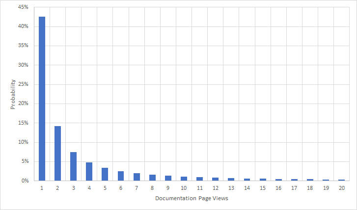
The probability that a documentation-related page has 3 or fewer page views is the sum of the first three bars, namely 64.3%. And the sum of all possible bars (not shown) is, of course, 100%. For additional information, see Probability density function and Cumulative distribution function.
Written by Karlito Bonnevie / May 11, 2022